The topic of neuro in art becomes more and more popular in the world and Neurotrend – as a leader of neuromarketing in Russia – tries and adapt all topical issues in neurosciences, pushing the boundaries of neurotechnologies and its applications.
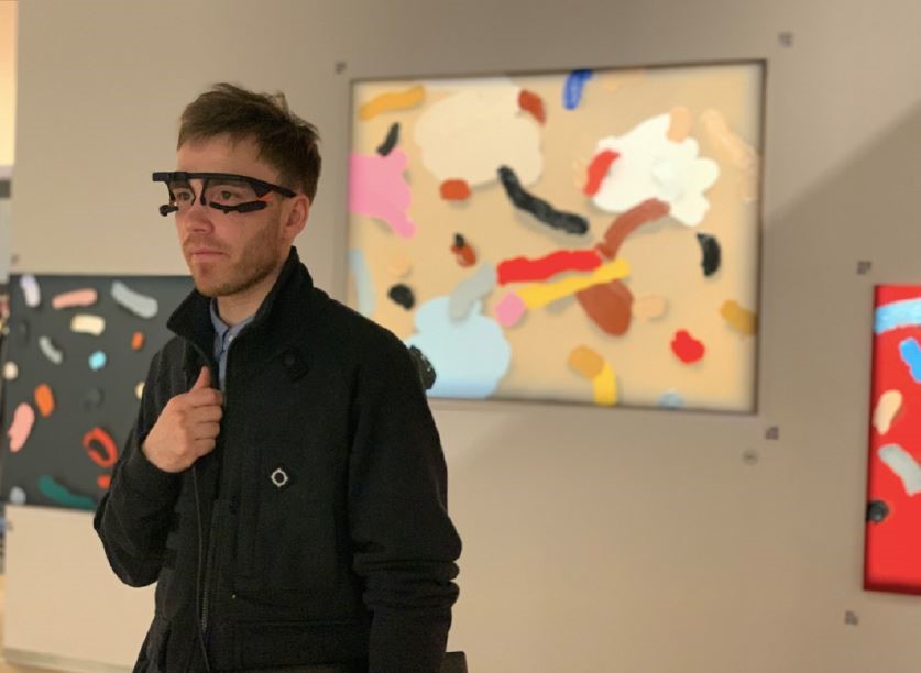
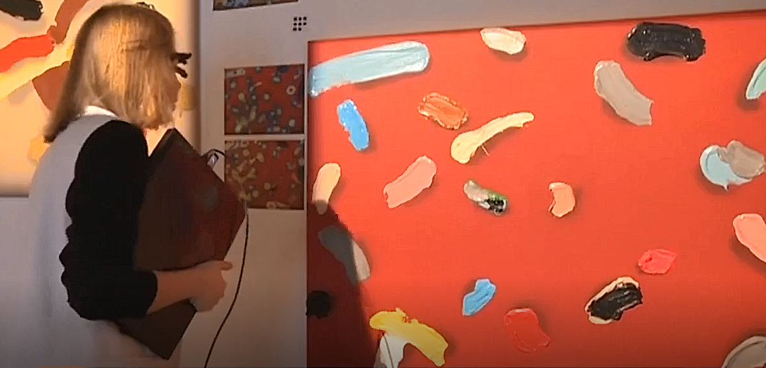
That is how we start our special projects and that is how we did our joint project with JART GALLERY and artist Dima Gorbunov. We have conducted neuromarketing research of perception beyond awareness of art collection “Find your Serotonin”. We have learned how art is perceived by professionals and amateurs as well as how the personality of artist influences the introduction to his/her art. 45 respondents took part in our research: 22 art professionals and 22 amateurs. A separate group of 10 people was accompanied by the artist in the gallery and listened to Dima’s explanations of each painting. In the study we used portable eye-tracker Pupil and bio-bracelet N-Trend-BIO

The successful scientific researches of human brain raise interest among people of various occupations including artists. “5HT” project of Dima Gorbunov is one of the examples of reflection upon certain aspects of neurophysiology. Dima decided to focus on serotonin as a brain transmitter associated with positive emotions, feeling of happiness and self-confidence. The lack of serotonin brings down mood and even leads to depression. With a help of figurative art language, Dima has demonstrated his vision of this phenomenon in series of paintings and sculptures. The main idea of the project was to discover serotonin by artist in each piece of art. At the same time Dima wanted to stay closer to reality and investigate the influence of art on human and that was the main goal of our special project “Find your serotonin”.
Does the story of the artist about his pictures change the emotional reaction of viewers? How strong is the influence of art professional background on perception of art? What are the main differences in behavior in contemporary space between amateur and professional? To answer this and many other questions we conducted psychophysiological research using modern equipment at Dima Gorbunov’s exposition in JART gallery.
The innovational peculiarity of this research was in joining two devices that record different physiological reactions. There were similar researches in the world before but usually in those was used either bio-bracelet or the research was static. In our case the respondent was in natural conditions: he or she was the gallery guest who came to see the exposition. Our guest was in natural situation and the conditions of walking in the gallery didn’t differ from realistic (neither route, nor time were limited) – this fact allowed to get even data across the audience. To analyse attention we used portable eye-tracker like this:
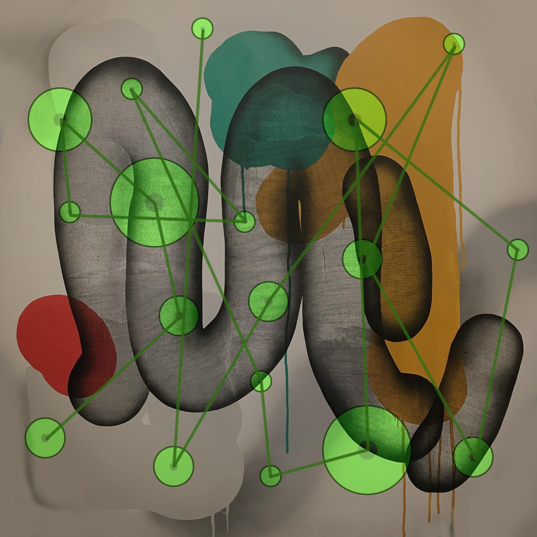
Eye-tracker allows to track gaze direction and fixations duration on certain objects. We wanted to see what attracts most of the attention. And as we discovered, the fixations of the professionals and of the amateurs rarely coincide. First of all, the professionals were overall more attentive – they took a closer look and stepped back, examined the material and colored elements. It might be that this examination provided additional information that resulted in other emotions than that of amateurs. On the heat maps of visual perception, we can see more colorful red spots in certain areas of the painting.
Secondly, the professionals examined not only the object on the paining but also the background that was very important and meaningful according to the artist’s words – the background is made in particular artistic technique. The professionals were very interested in this and paid attention to the technique that probably remain unnoticed by the amateurs.
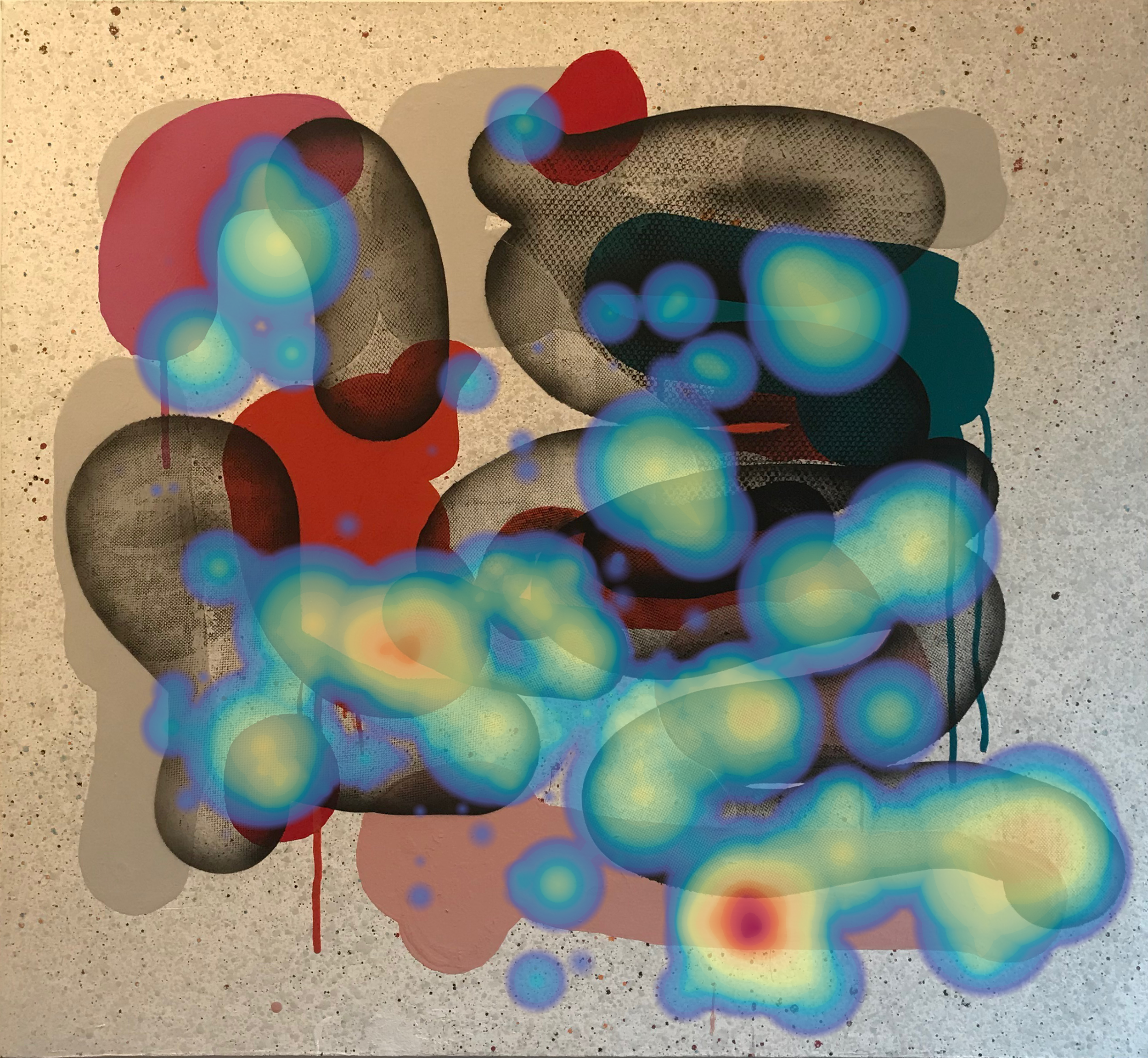
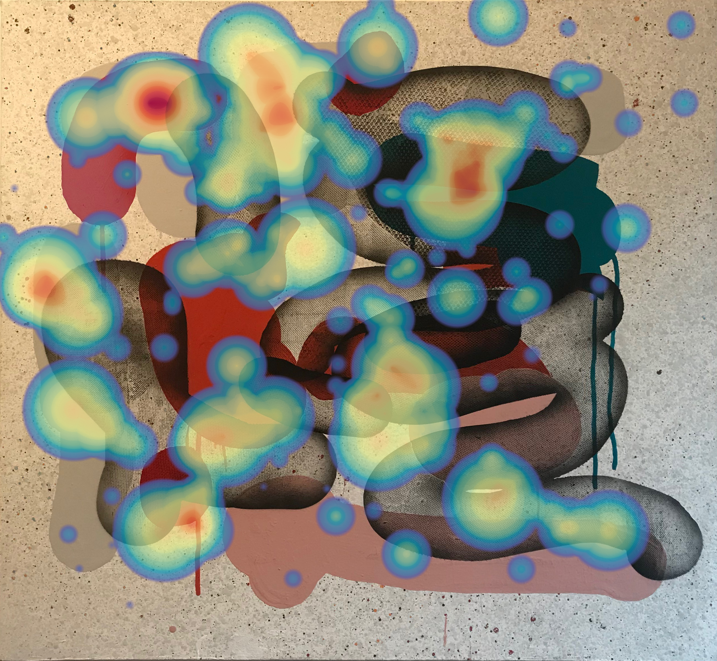
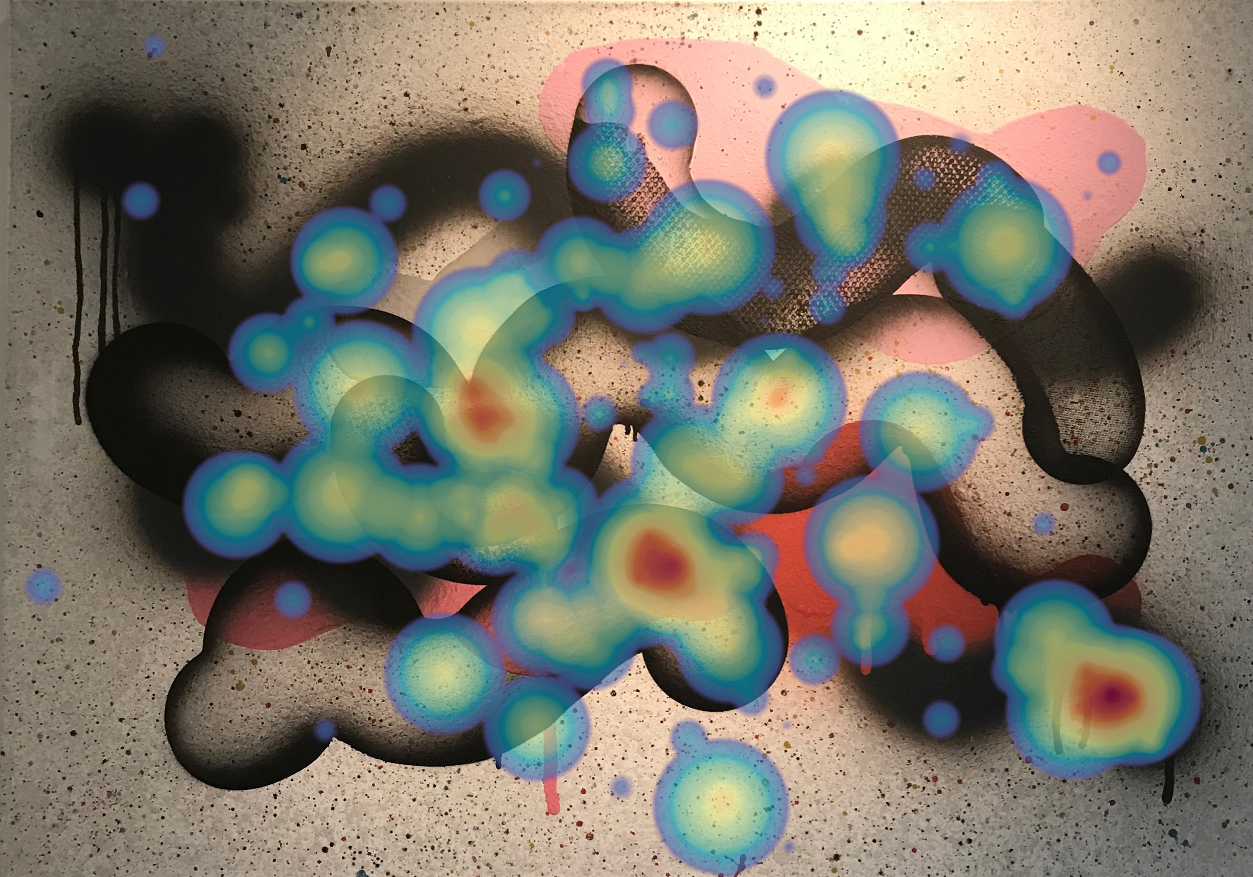
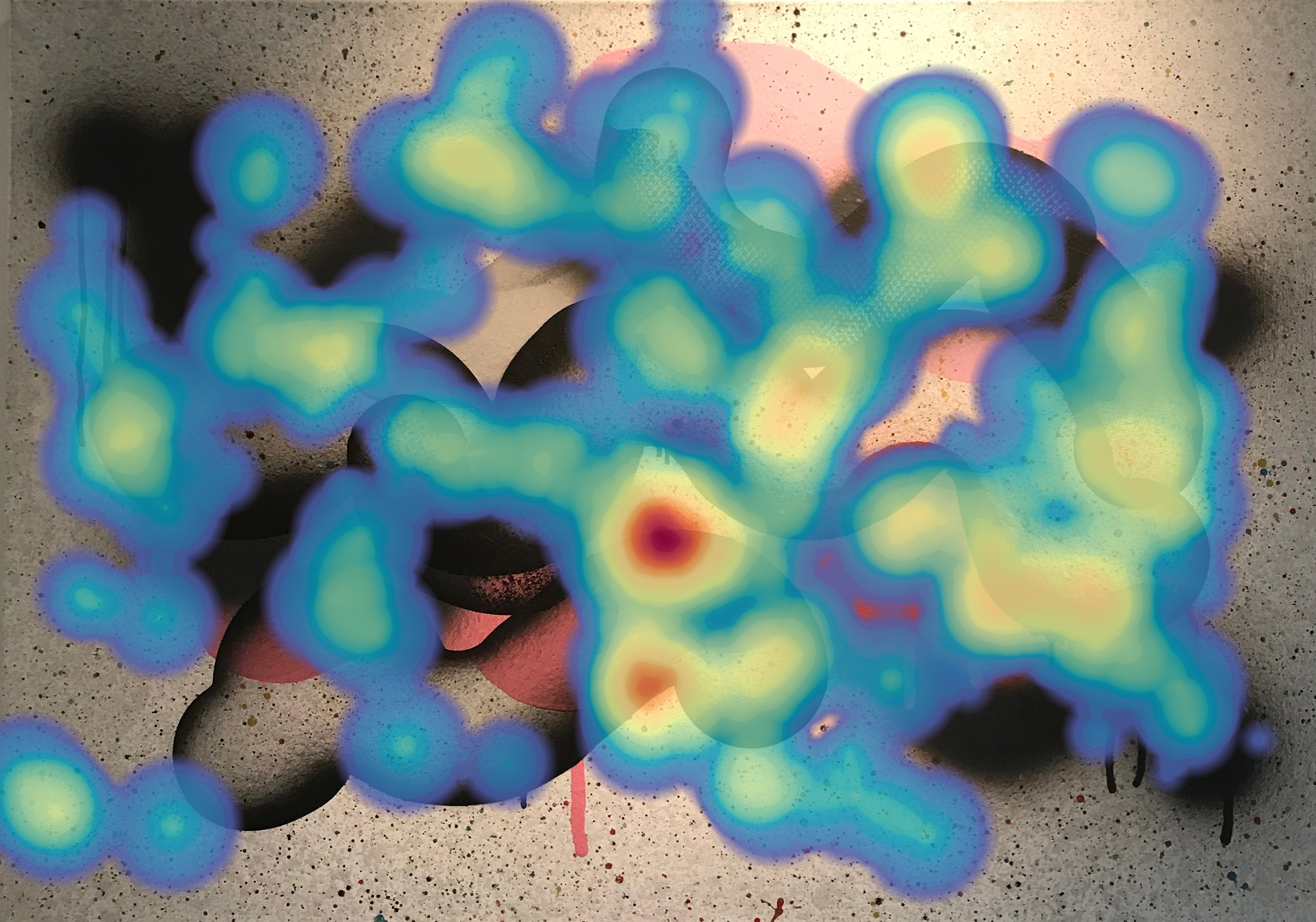
It is also worth mentioning that the professionals covered the painting with the attention more fully, so to speak. It seemed like there is no place on the painting that haven’t attracted their attention, every detail was meaningful to them and that is why the heatmap area of coverage is much bigger.
Of course, it was important to also track emotional reaction. To objectively record emotional changes, we used bio-bracelet (same technology is used in lie detector that register emotional changes). Our interest was in strength of emotional reaction and it’s sign (either positive or negative). The bio-bracelet recorded the changes of skin conductivity and vascular reaction on palms. It is widely known that when we experience strong emotions and also as a reaction to unexpected and unusual stimuli, our skin conductivity rises. This process is associated with the increase of sweat coming from the sweat glands that are located on palms and feet. On the contrary, negative emotions results in spasms and vasoconstriction (narrowing of vessels). Registration of vascular reaction with photopletysmogram helps our specialists to evaluate the changes of emotions – to positive or negative direction – while perceiving the paintings.
Yes, and the results are quite spectacular! If we judge only by emotions, we could see that people who don’t have any background in art, are more loyal to it and perceived the paintings in more positive way. Average values of emotional valence (which complies with emotional reaction “like”/”don’t like”) is much higher than those of professionals. And the sign rarely differs from painting to painting – the changes of emotional valence are small. Everything looked interesting and was perceived positively.
The other story happened to professionals. They were more critical and average values of emotional valence were lower. But at the same time, different perception of different paintings was more pronounced. Some paintings were liked much more than the others. Variation of emotional indicators are significantly higher. It means that some paintings provoked strong positive emotions whereas the others don’t; the amateurs perceived every painting almost equally. Speaking about emotional engagement, this metric was two times higher among the professionals compared to the amateurs. And also, variation of engagement was pronounced between different art works. If laymen perceived the pictures as abstraction - quite interesting but complicated to understand – the professionals on the contrary learned details, nuances, peculiarities of artistic language and qualities of emotional transition made by the artist. Some paintings were perceived warmly while the others provoke even irritation (see “Emotional map of exhibition).
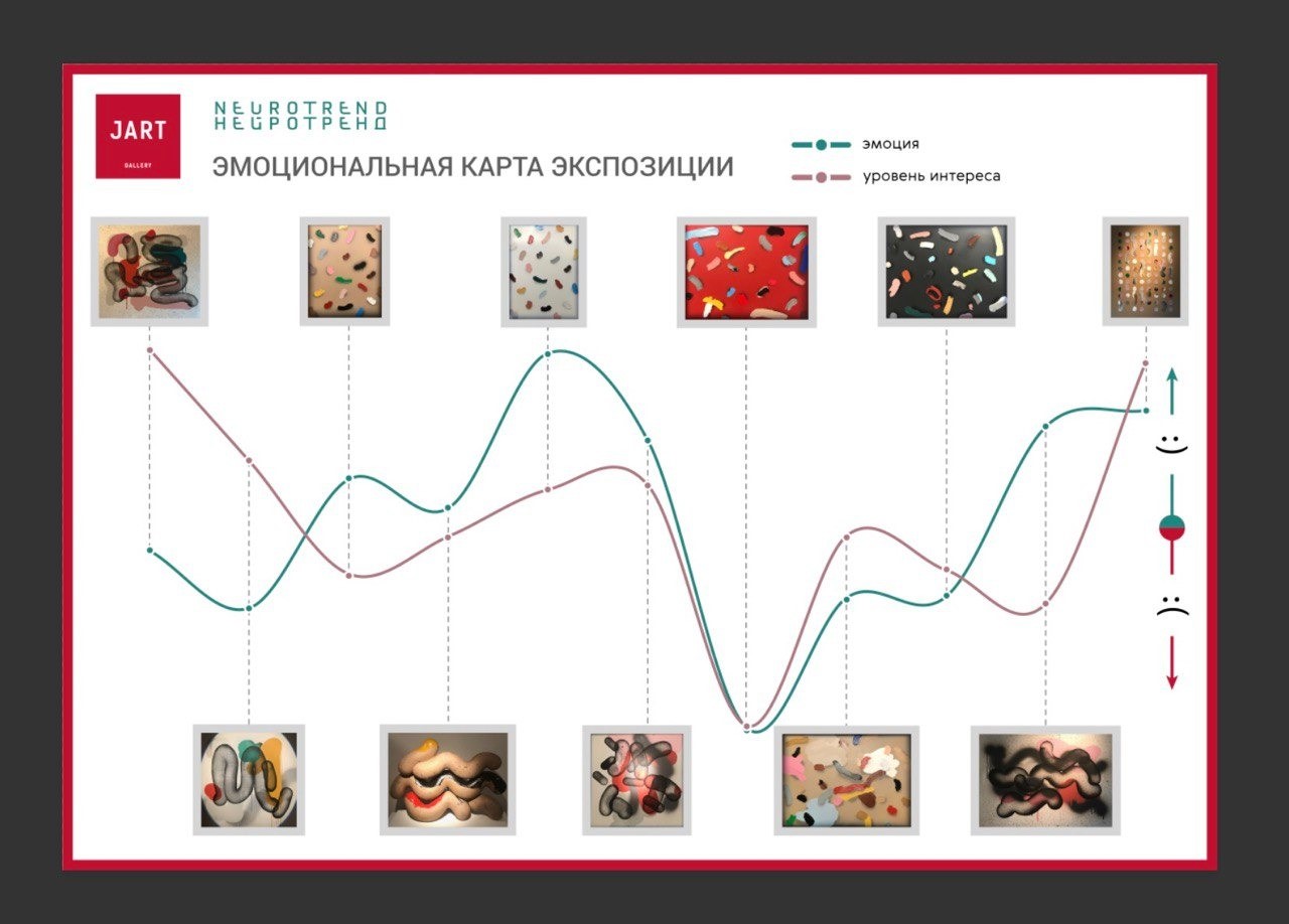
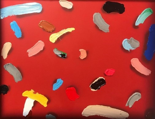
The painting “Reaction to red” provoked the biggest negative emotion. It is interesting to mention that similar reactions were found among both the professionals and the amateurs. We suppose that it could be because of red color that usually provokes agitation and activation. But here also lies the mystery: while this work had the lowest valency (was disliked), it also provoked poor engagement - it was perceived as boring, not worth attention. This is also evidenced by attention metric – people viewed this picture for less time than the others.
The amateurs liked “The table of rare molecules”, the second place took “Sleeping molecule”.
The professionals liked the most “Reaction on white”, “Sleeping molecule also took the second place but it provoked not only positive emotion but also the highest emotional engagement – that means that it attracts and surprises with it’s unusual air. Also, the eye-tracker data shows that this work was examined for a long time from different angles.
There is still a question: did the conversation with the artist influence the perception of paintings? And the answer is – yes, absolutely. The people who listened to Dima’s explanations had the most positive emotions and the least critical attitude. And it was equally true both for the professionals and for the amateurs.
To sum up, we can see the following results:
 RU
RU